Design is an architecture of first impressions.
We translate business goals into digital experiences that work from the first click. Our portfolio isn't a gallery—it's a collection of solved problems, each with documented outcomes and constraints.
- • Legacy CMS Integration
- • Mobile-First Performance
- • Accessibility (WCAG 2.1 AA)
FinTech Onboarding: Turning Drop‑Off into Completion
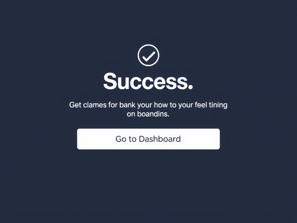
A Colombian neobank was losing 40% of potential clients during KYC verification. The process was a single, intimidating page—a textbook "first impression" failure. Our audit revealed users felt anxiety, not guidance.
We diagnosed the core issue: the lack of a visual progress pathway. Users didn't know how far they were, what came next, or if their sensitive data was being handled securely.
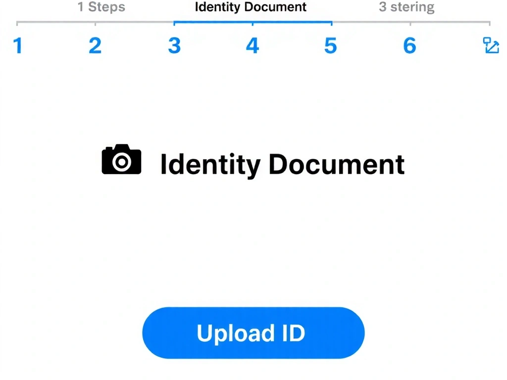

The "Dead End" Iteration
We initially designed a progressive disclosure pattern where help text appeared only after a failed entry. The client's legal team flagged it immediately: "We need informed consent at every step, not just after a mistake."
This was a pivot. We abandoned the elegant, minimalist interaction for a more explicit, upfront communication model. The interface felt less "clever" but became legally compliant and more trustworthy. The lesson: design must serve the real-world constraints of the system, not just the ideal user.
Pitfalls We Avoided
- 1 Over-engineering the UI. The "document preview" was a simple image overlay, not a complex component.
- 2 Ignoring load times. We used SVGs for icons and lazy-loaded the camera module to keep the initial screen under 2s on 3G.
- 3 Subjective validation. All success metrics (22%, 35%, 50%) were measured against the live pre-deployment baseline.
By Industry & Outcome
A scannable overview of our experience. All projects share a 12‑week timeline constraint from kickoff to launch.
| Industry | Projects | Key Outcome | Focus Area |
|---|---|---|---|
| FinTech | 1 (Featured) | +35% Completion | Onboarding Flow |
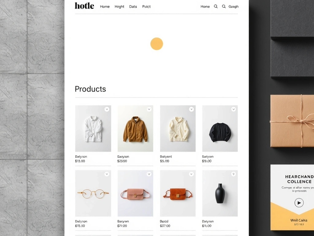
| E‑Commerce | 3 | -18% Cart Abandon | Checkout & Product UI |
| B2B SaaS | 2 | Reduced 7→3 User Steps | Dashboard Simplification |
| Cultural | 2 | +40% Event Ticket Sales | Editorial Microsites |
| Non‑Profit | 1 | 2.5x Donation Rate | Funnel Optimization |
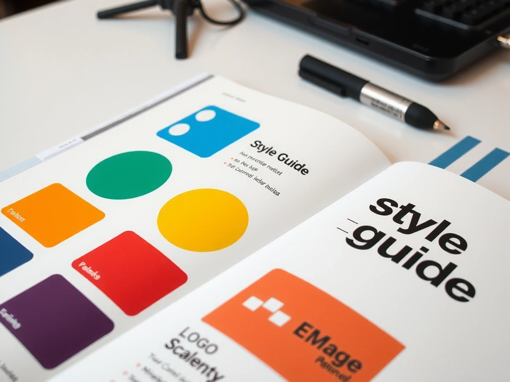
From Chaos to Cohesion: The Brand System
"Without this system, their upcoming holiday campaign would have required a full redesign." — Internal Project Audit

Questions to Ask Any Studio
Ready to see how your project could work?
We'll start with a brief, no-pressure conversation about your goals and constraints. If it's a fit, we'll propose a clear path forward.